Pantone® Cotton Swatch Library Redesign
Redesign the fabric organization system used by professional colorists and fashion designers to be more efficient and user friendly.
This product was released in March 2020 and is currently on the market.
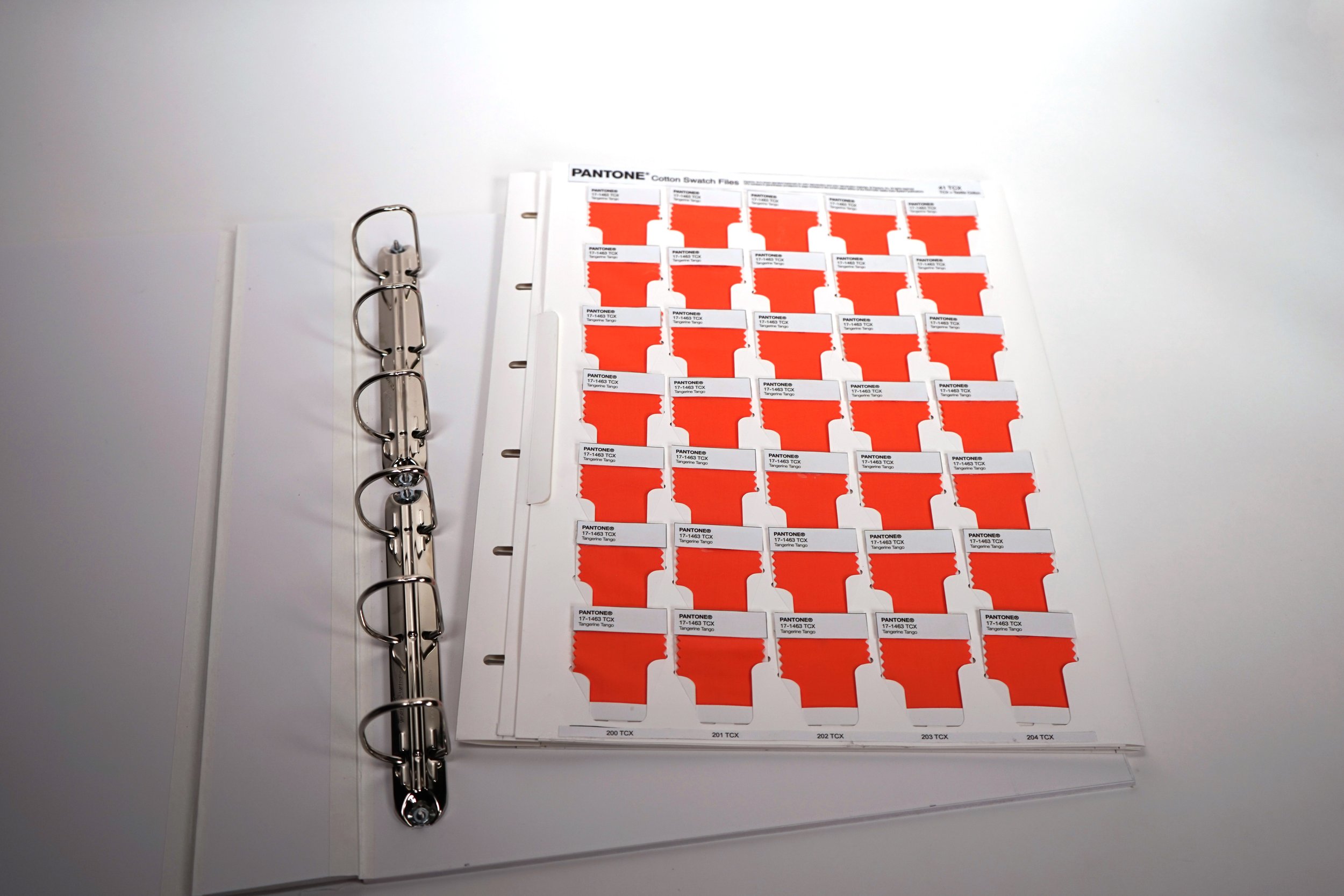
As a professional design tool, the Cotton Swatch Library needs to be functional and efficient for colorists and designers to use every day. The legacy design forced users to create their own workarounds to improve the experience. Some of the key problems we sought to solve with the redesign of this product were:
Issues securing the swatches in the book
We heard: “The swatches should not go against gravity. They should be connected at the bottom”
Ease of returning swatches to the proper location
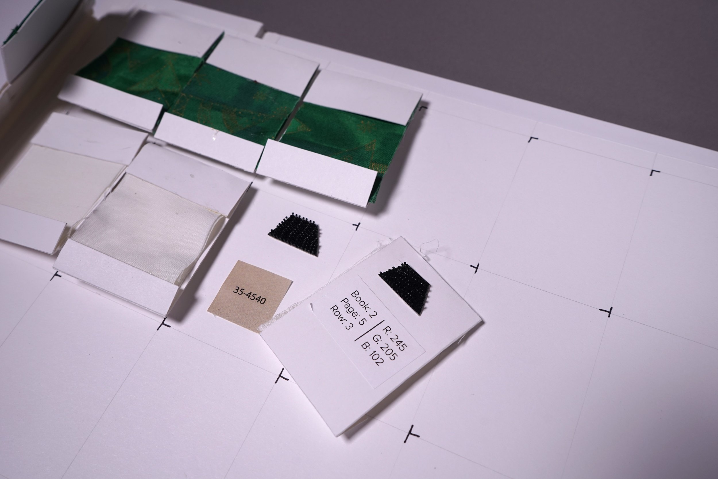
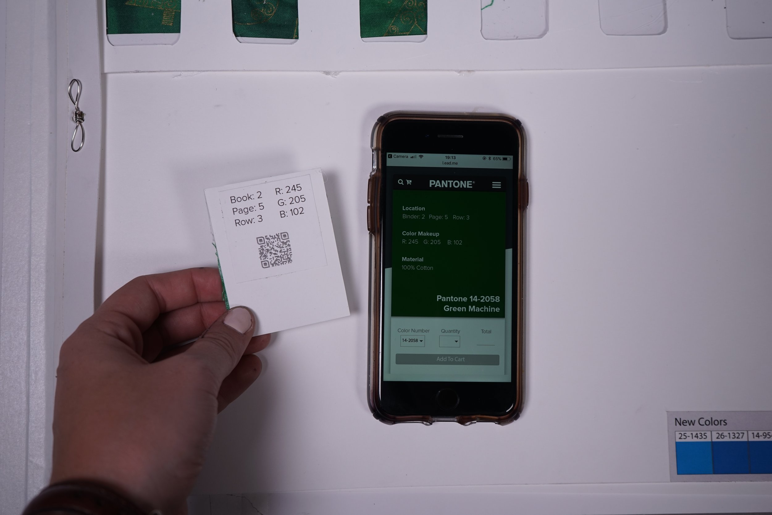
We heard: “If each and every swatch does not have a record locator on it, I won’t buy it”
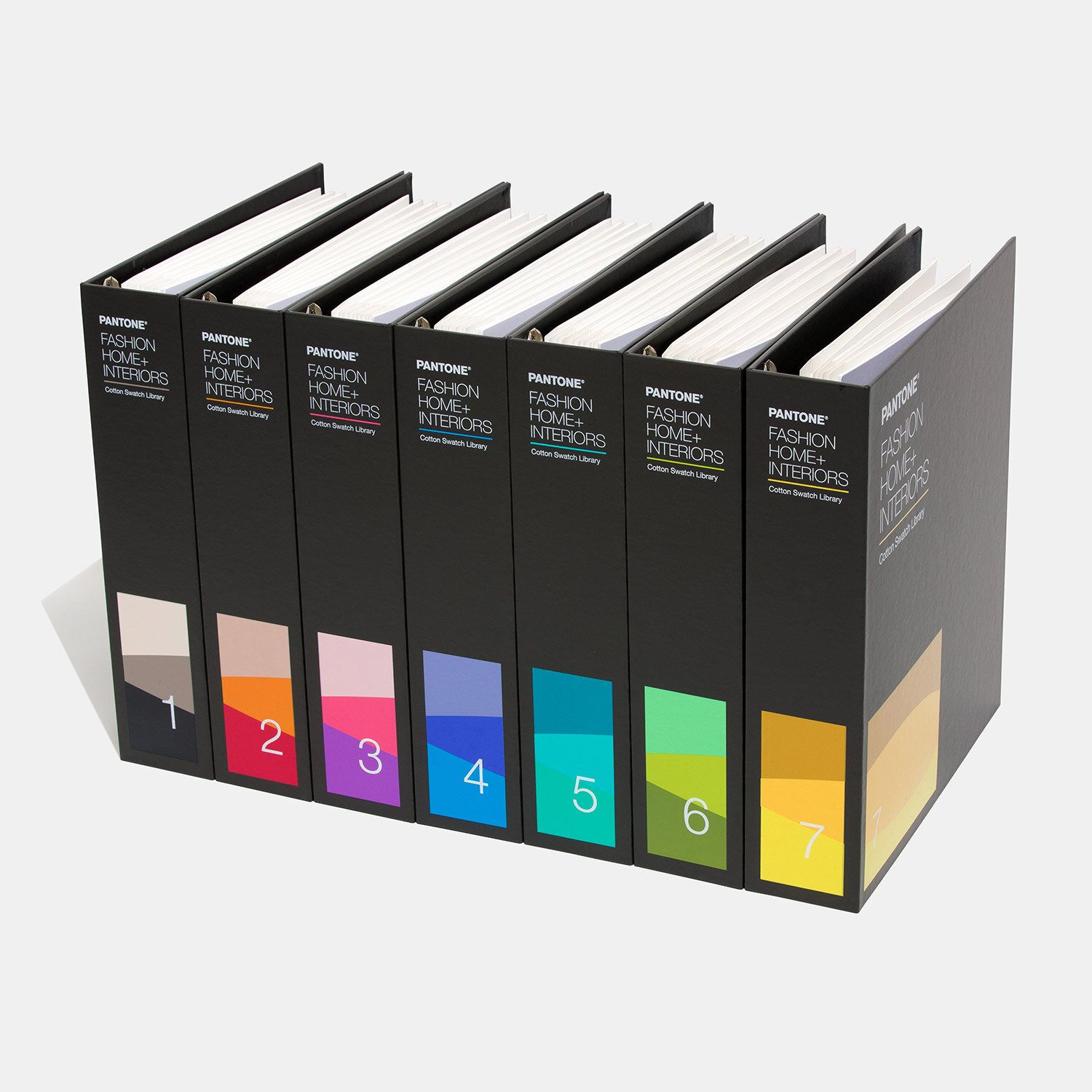
Lack of colorway identification on the outside
We heard: “The exterior should show what colors are in each. The number system isn’t enough when a color way is split between binders”
Early Concept Development
Initial brainstorming focused on various features that could be leveraged to improve different aspects of the user experience. Areas of exploration included:
Swatch security
Swatch identification/relocation
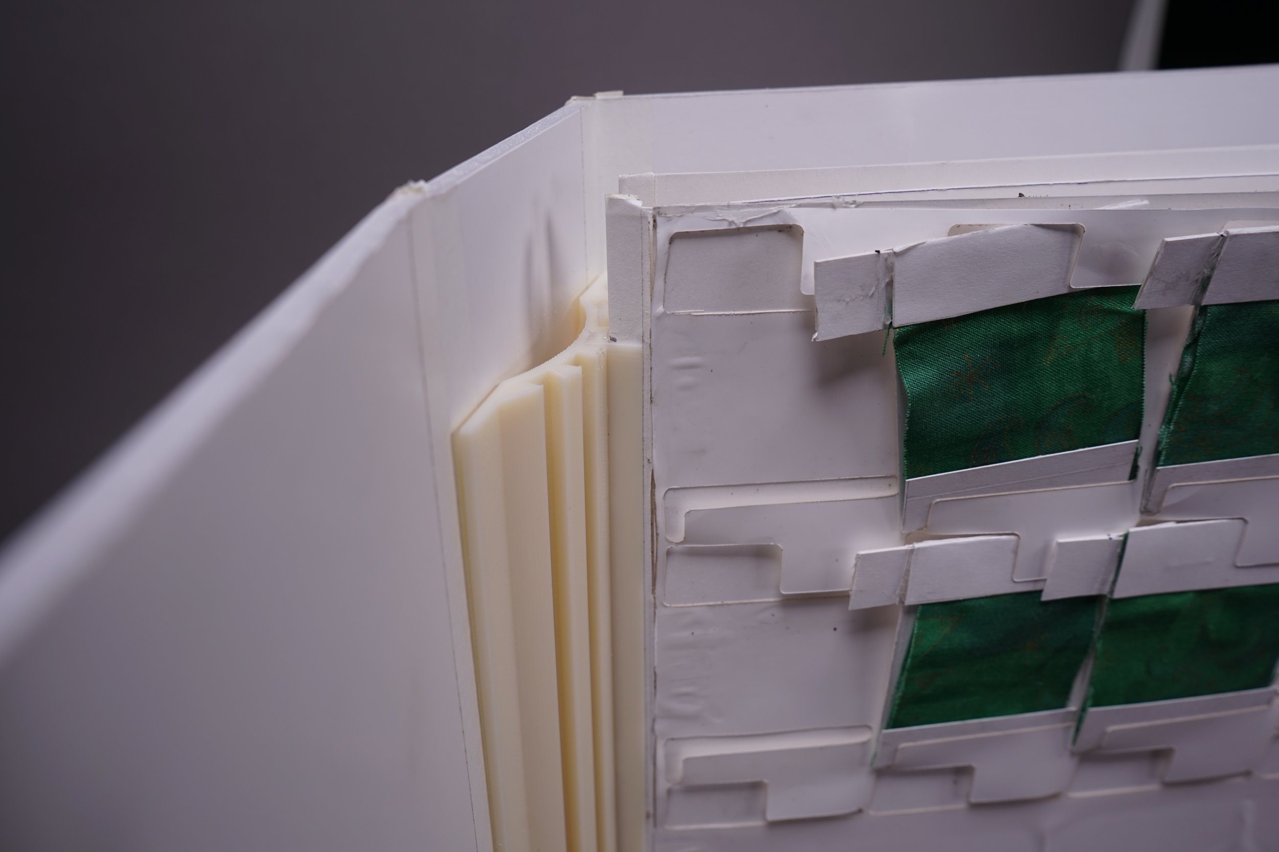
Page security/flexibility
Swatch removal
Prototype Development
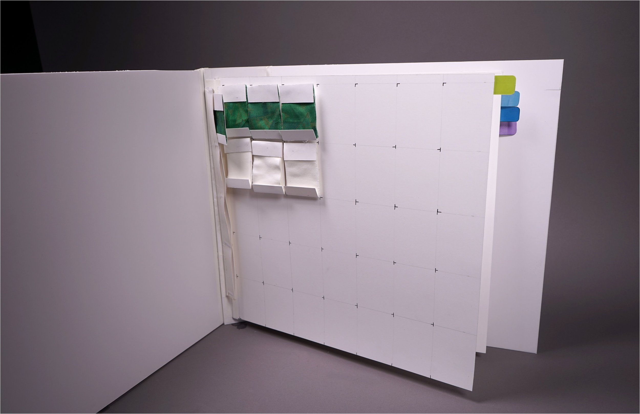
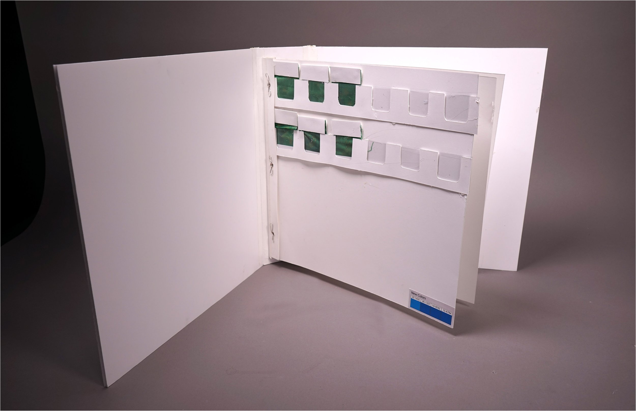
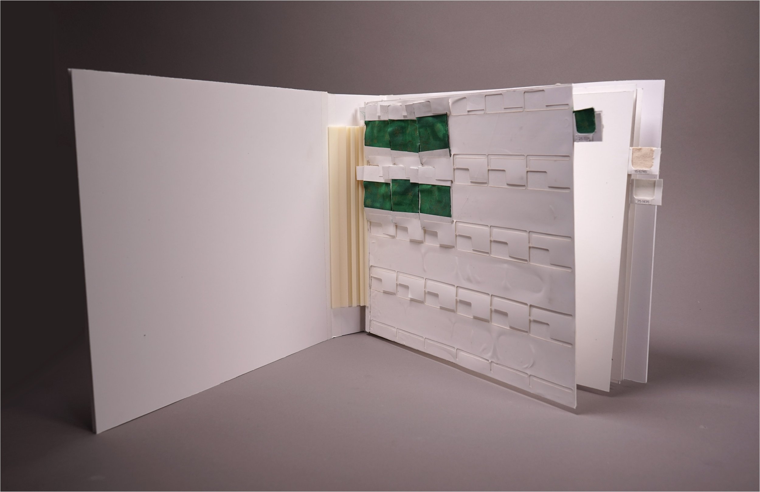
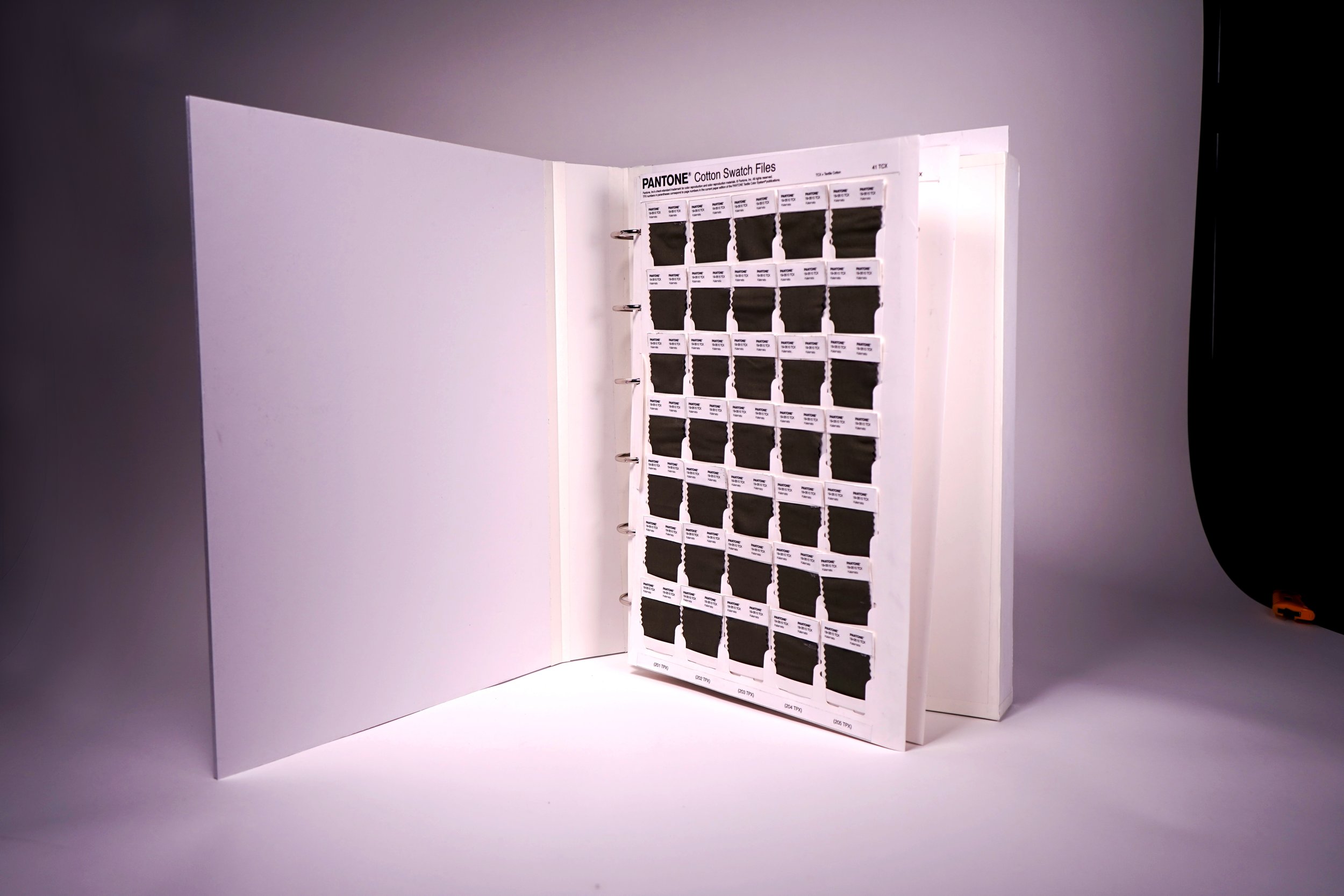
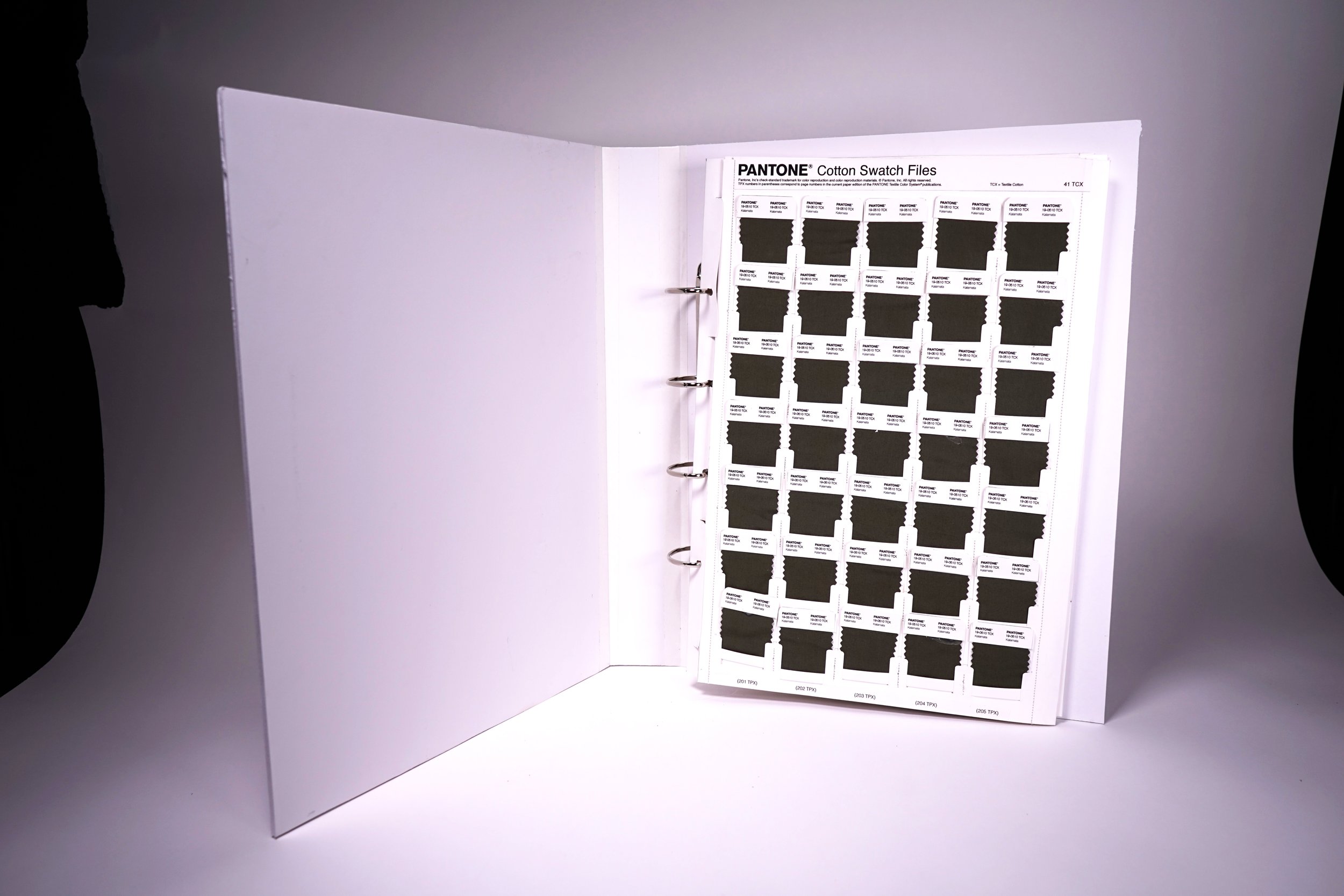
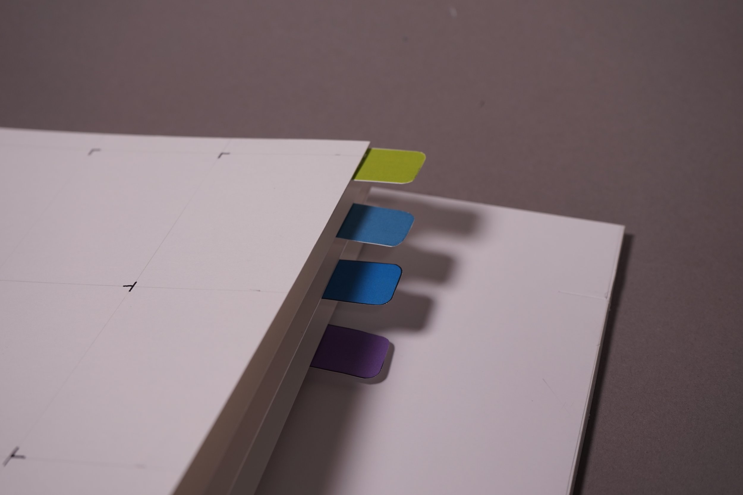
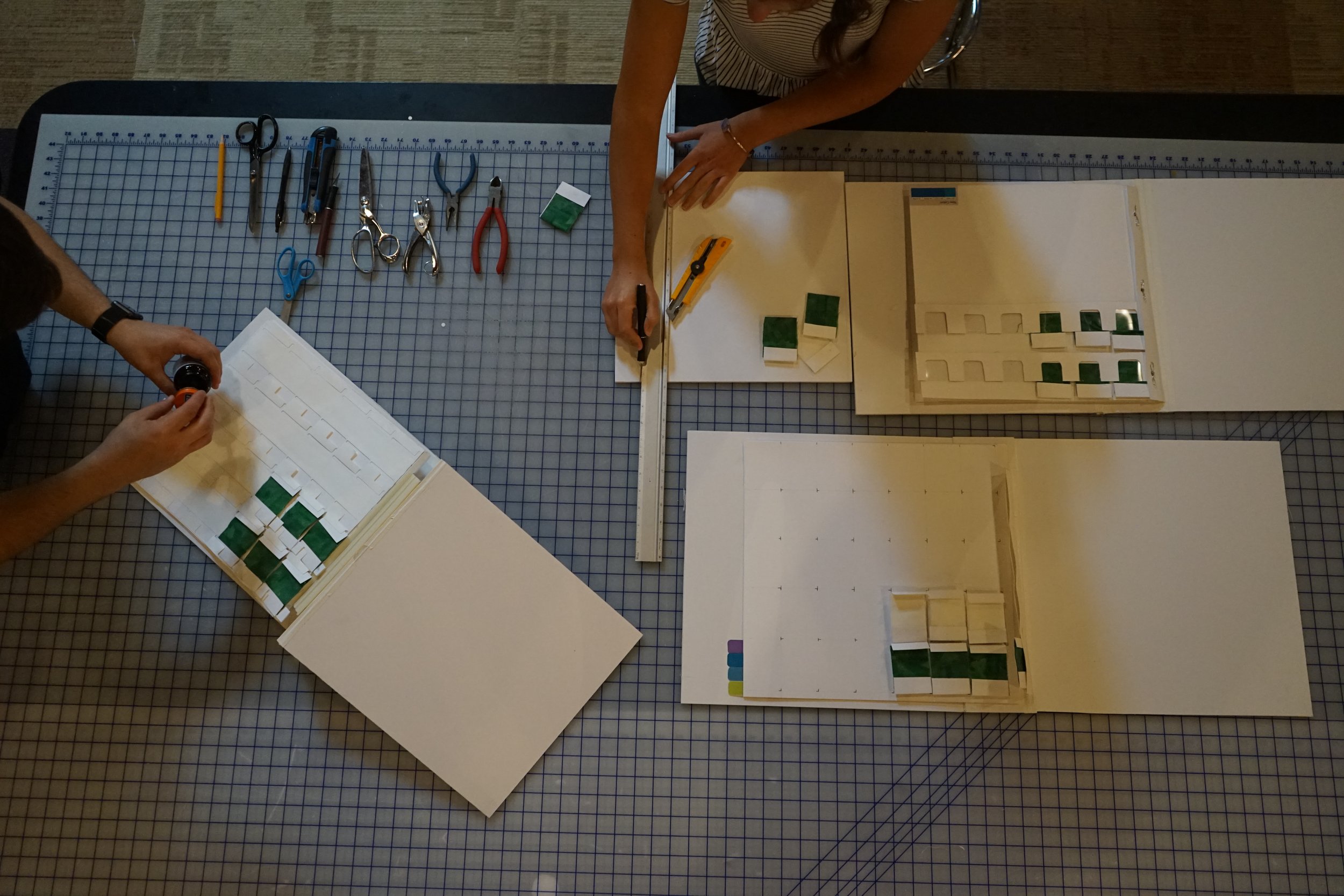
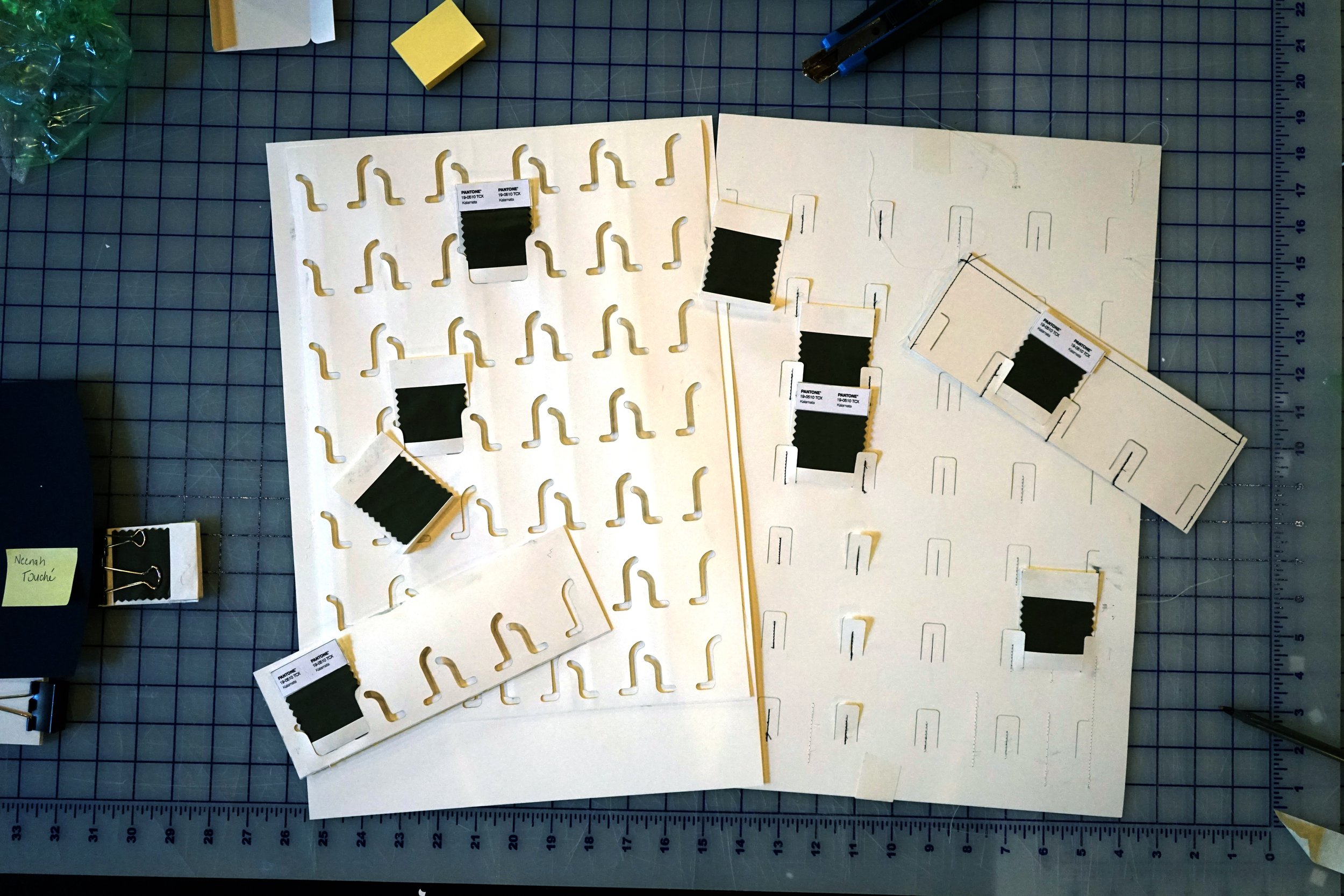
The majority of this project was spent prototyping features that were then included in holistic concepts meant to demonstrate the experience of using the system from start to finish. The prototypes increased in fidelity as the concepts evolved.
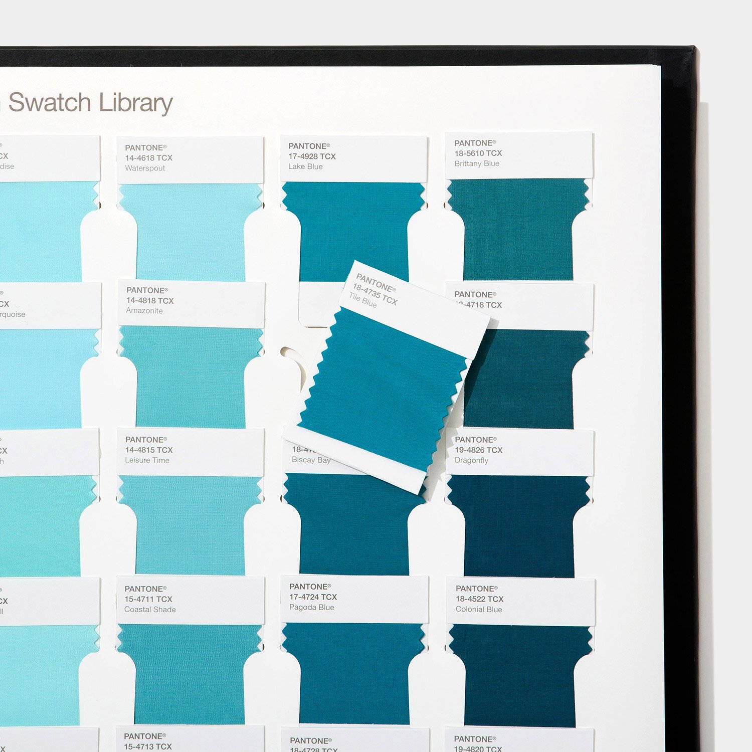
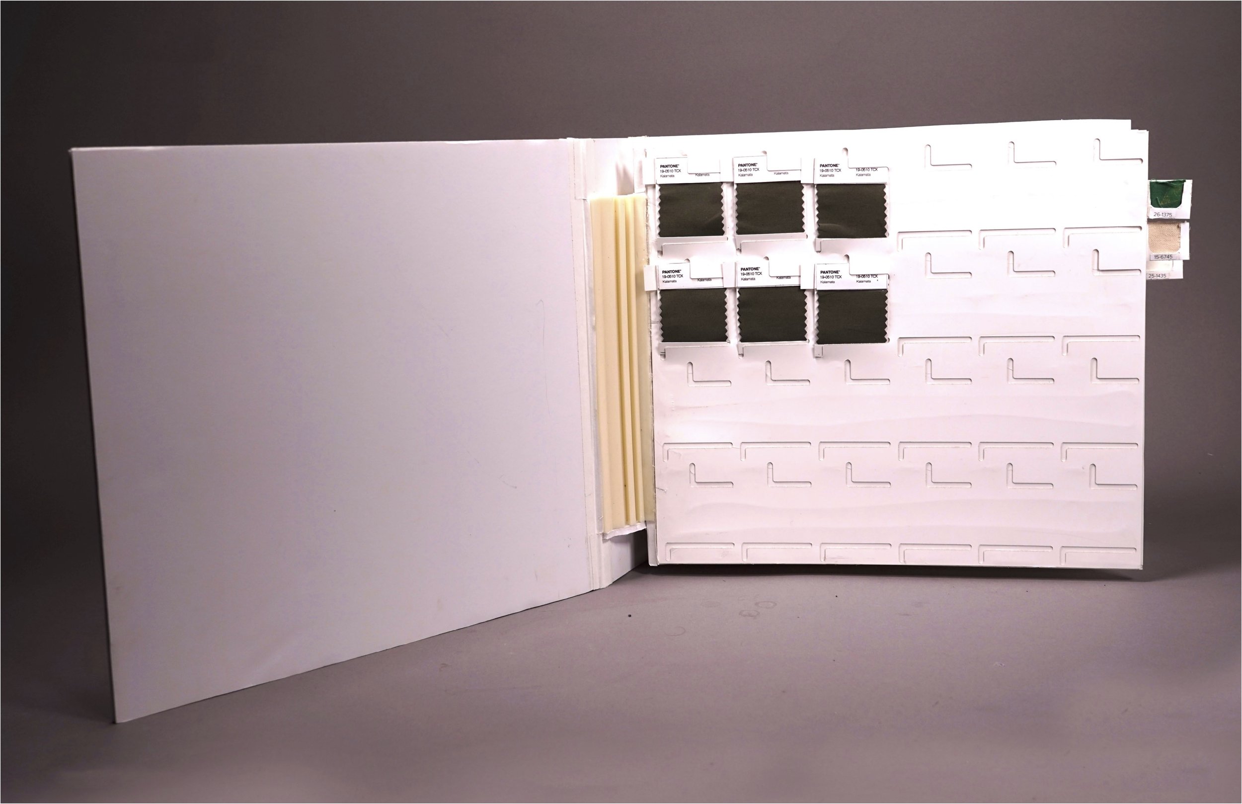
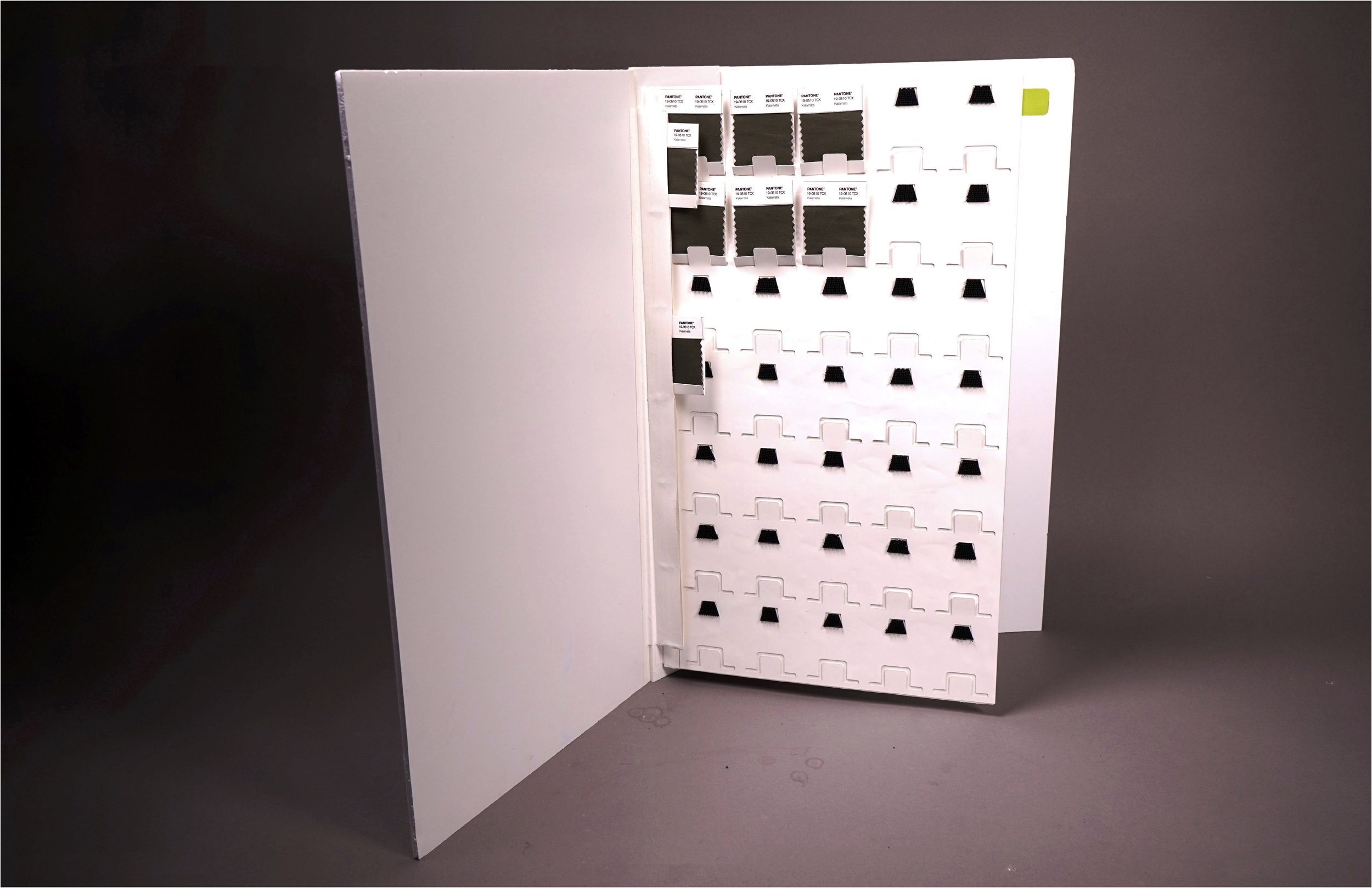
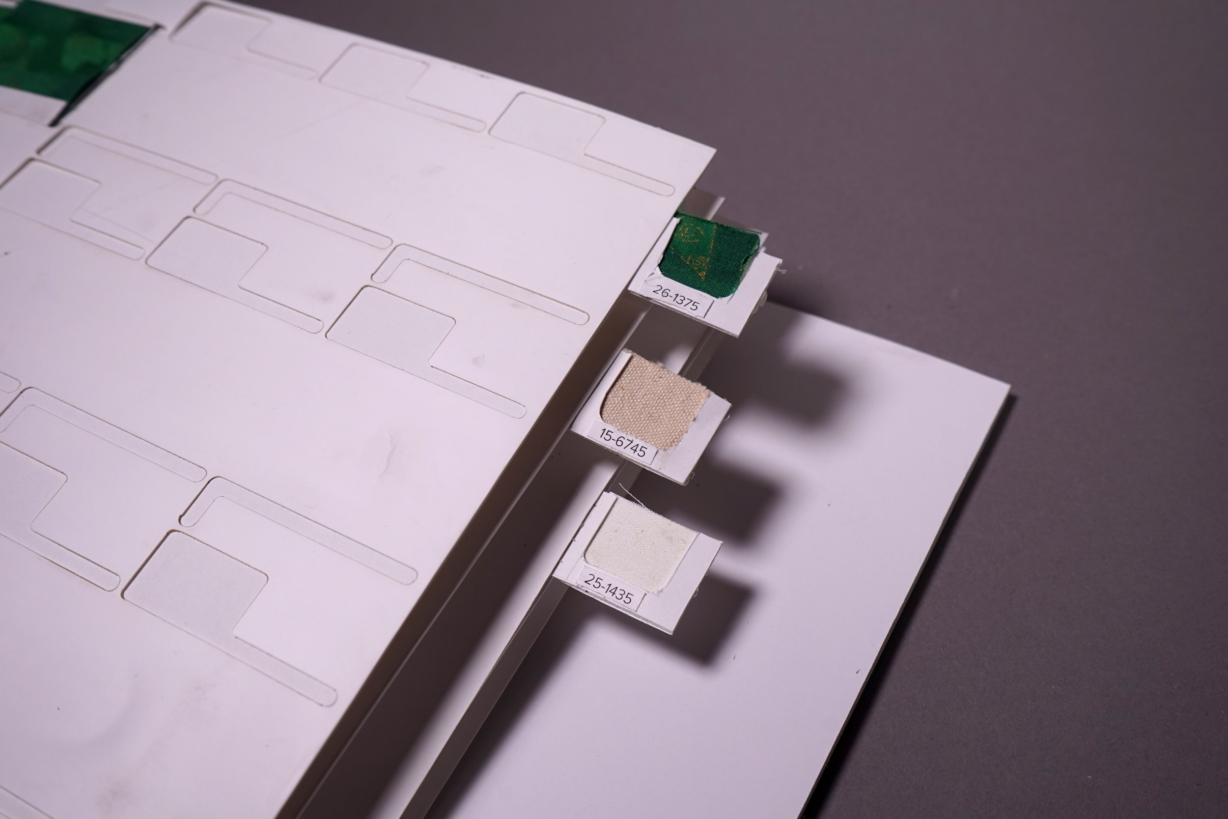
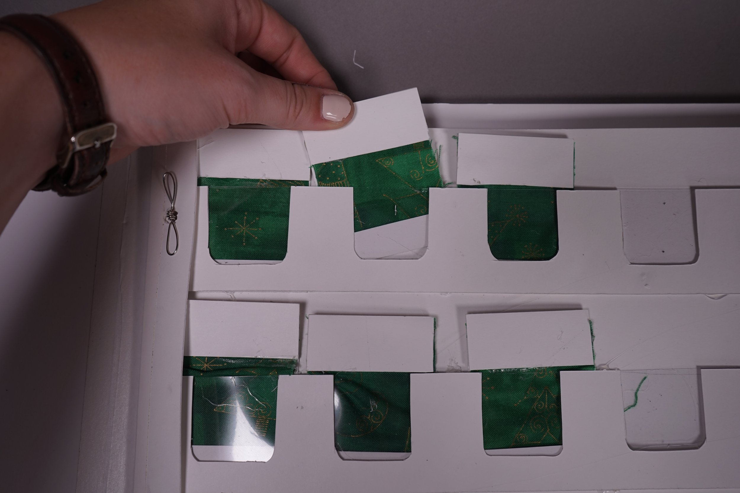
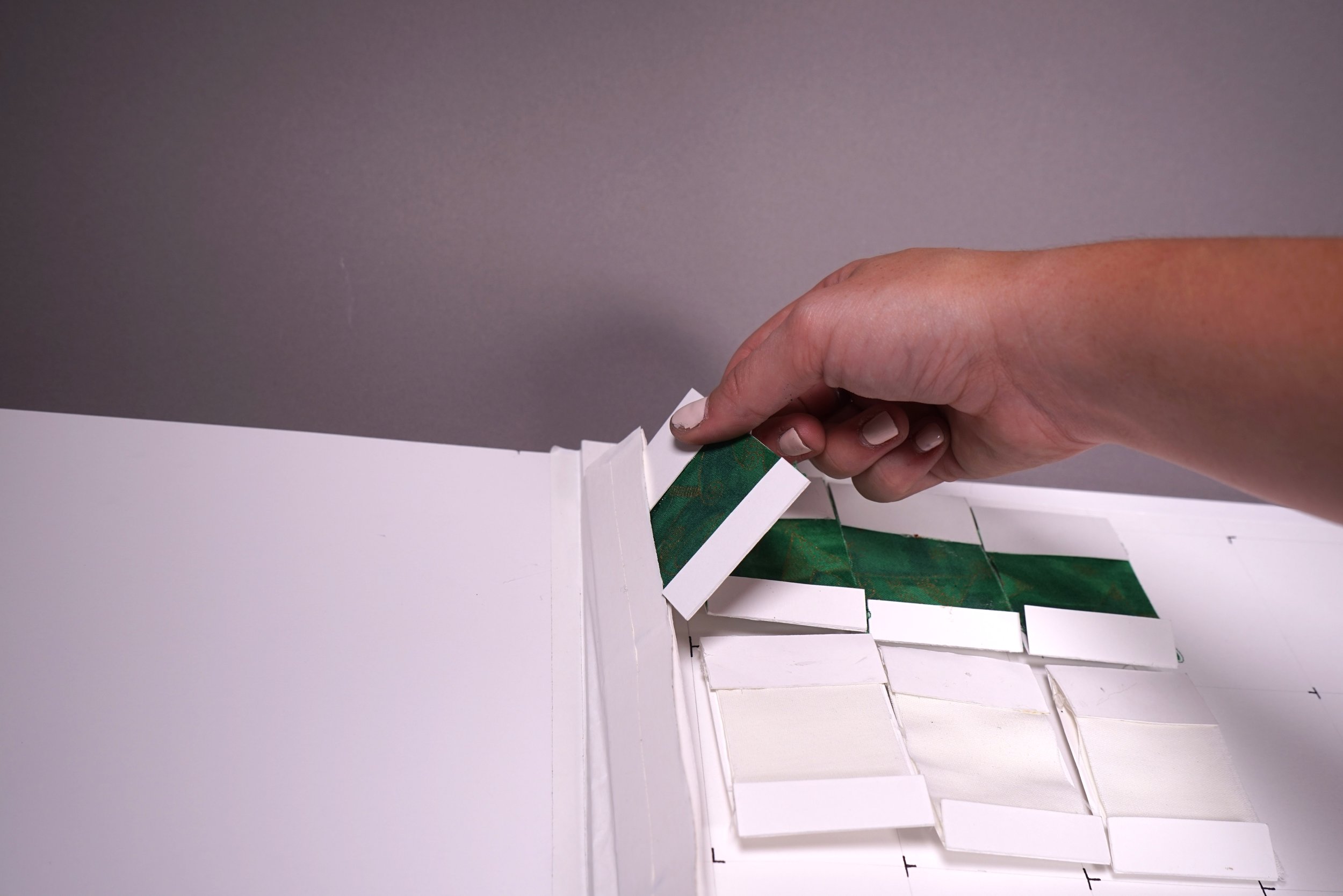
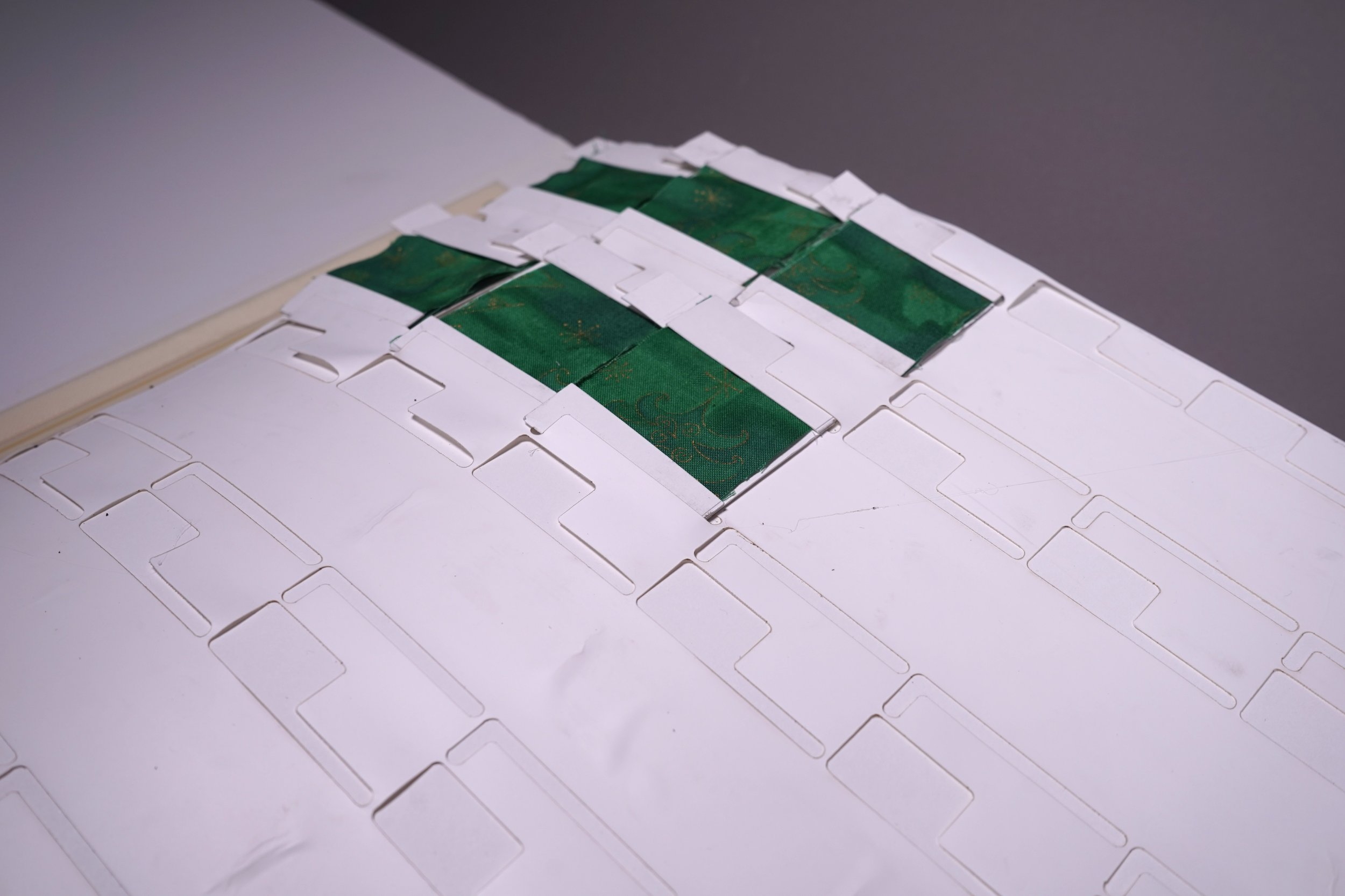
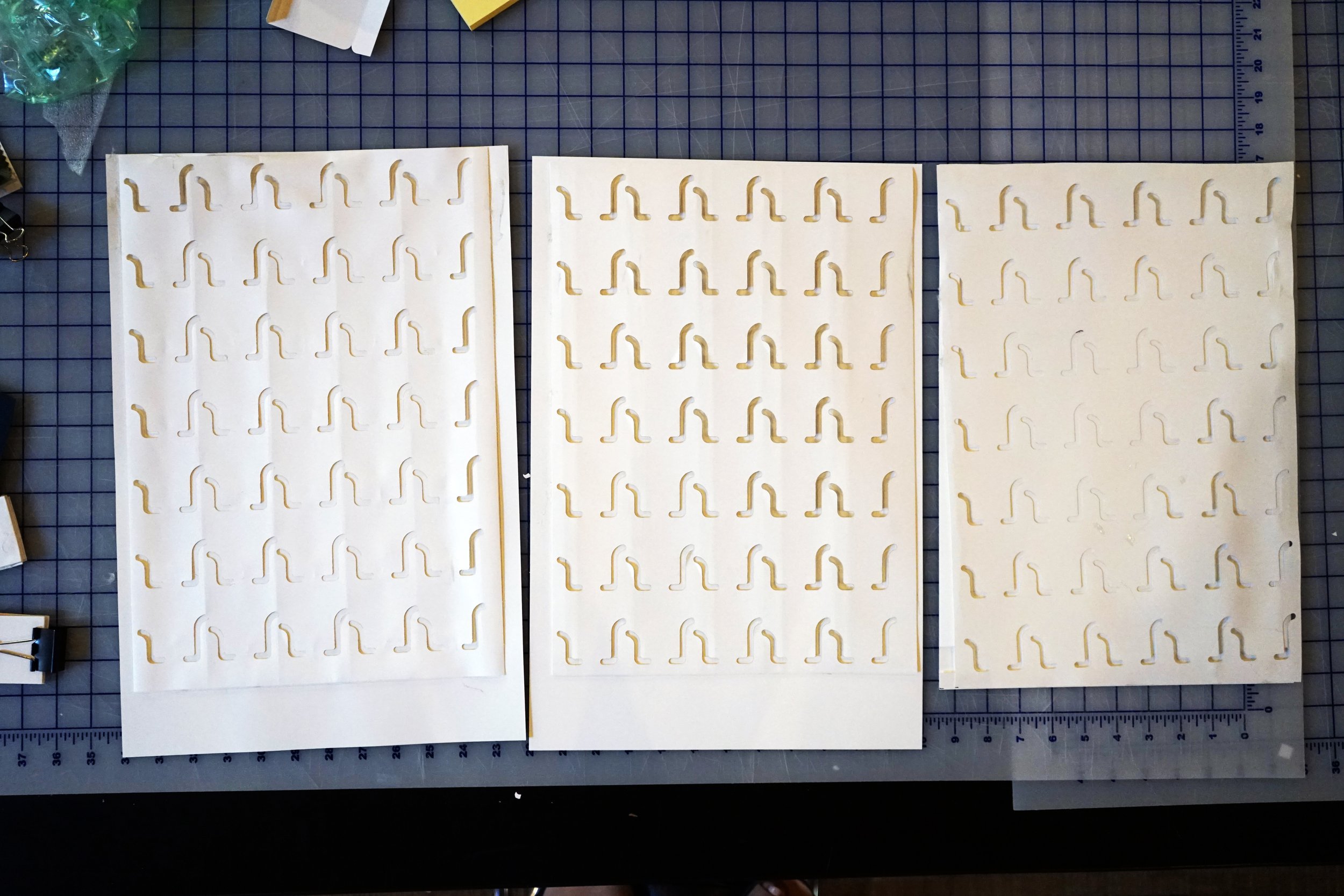
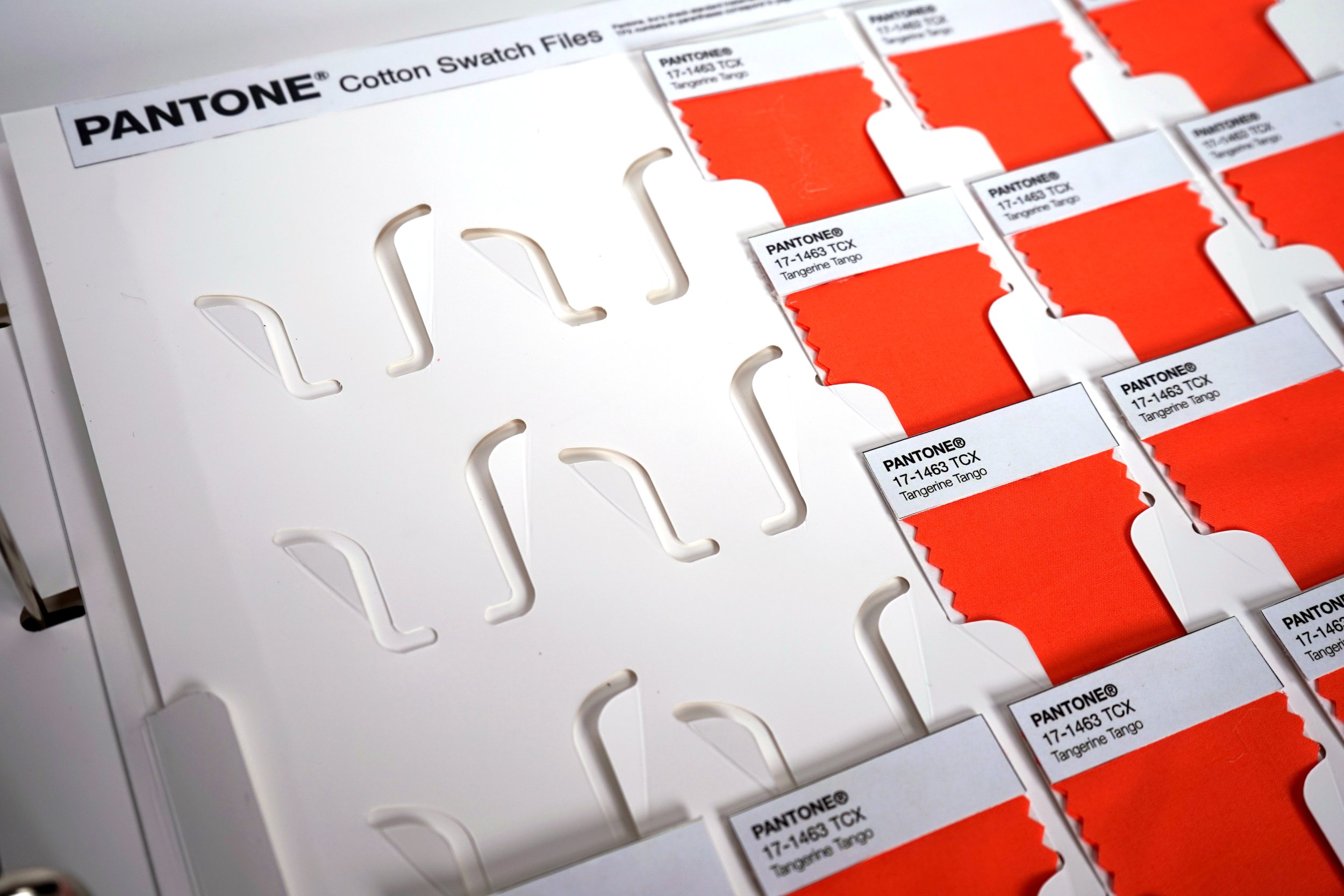
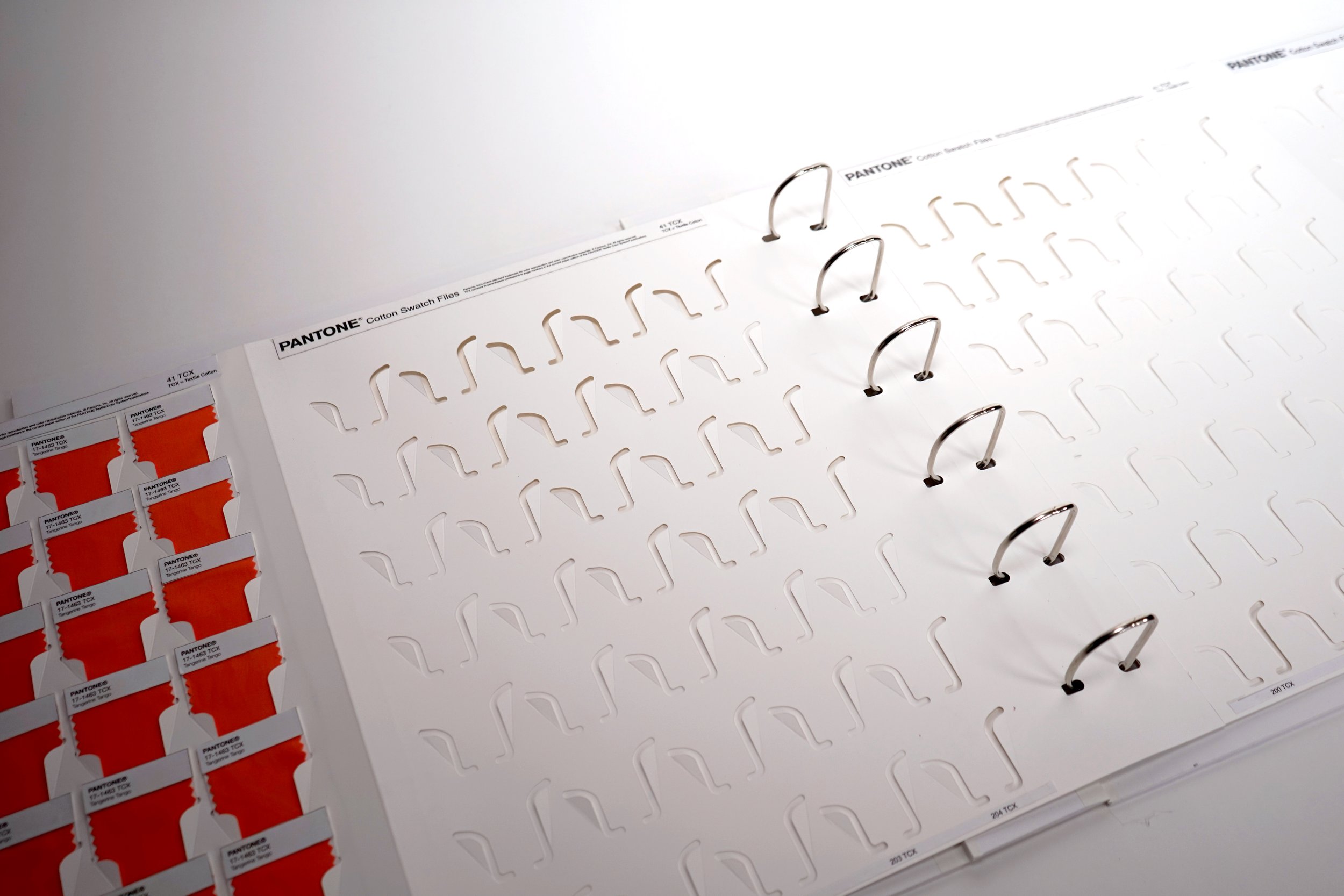
Once the experience was more developed, our exploration was more focused on finding the best method, pattern, size, spacing, etc for holding the swatches securely on the page so that they were easy to remove and replace, showed as much of the color as possible, and did not fall out when the book was being moved.
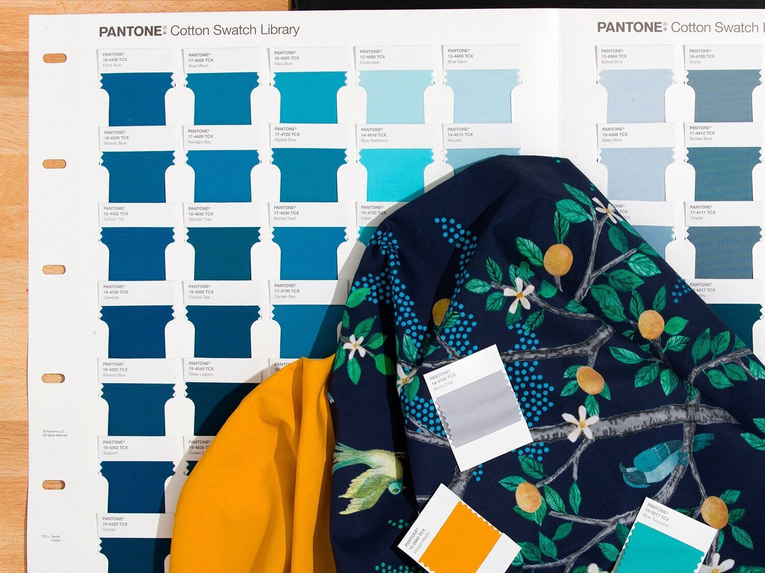
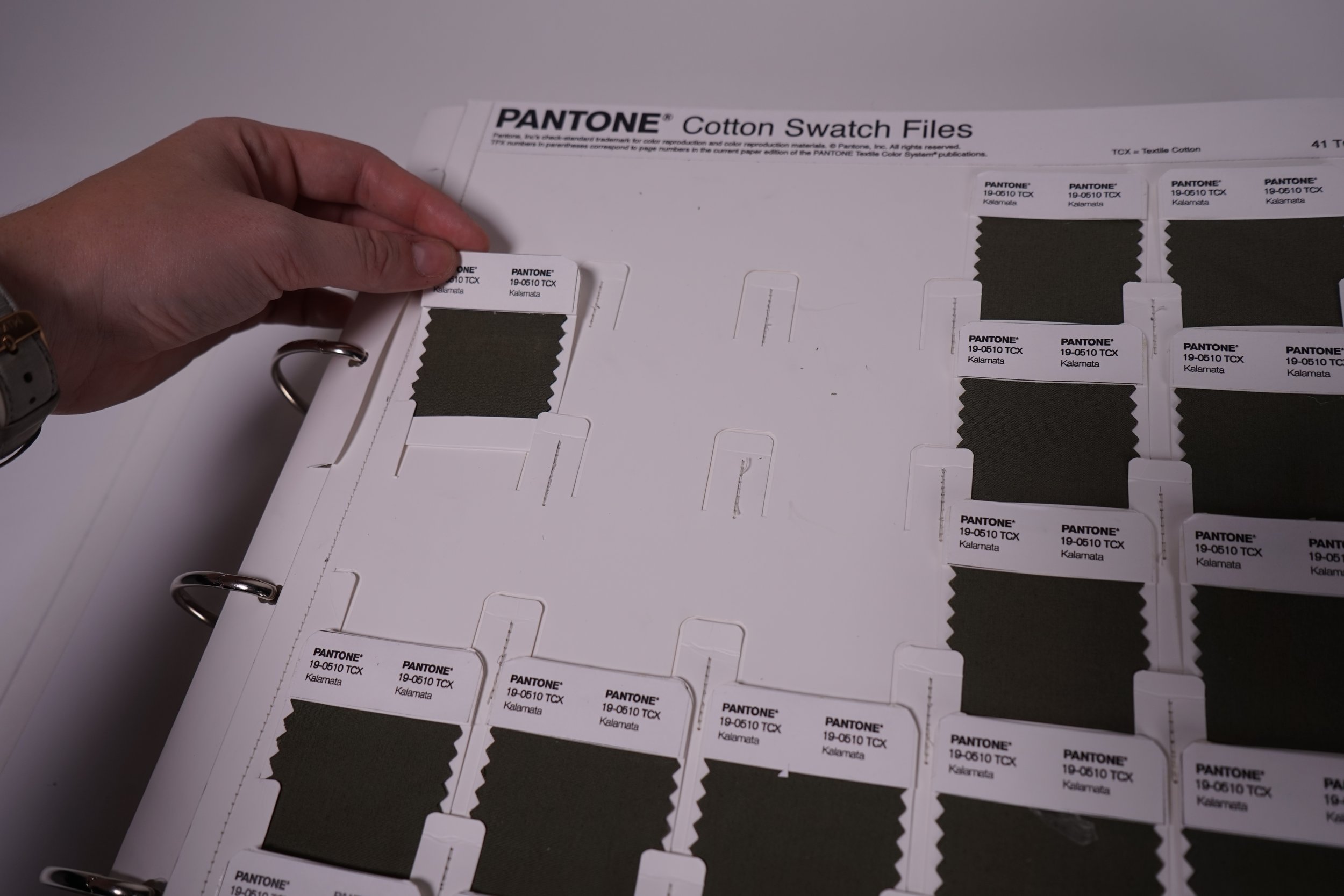
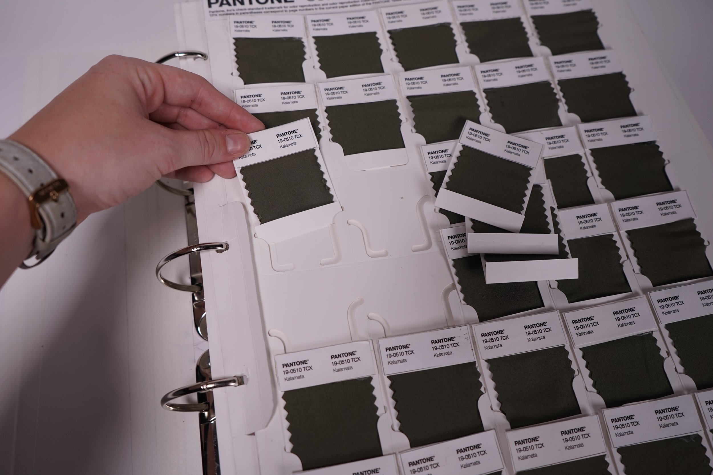
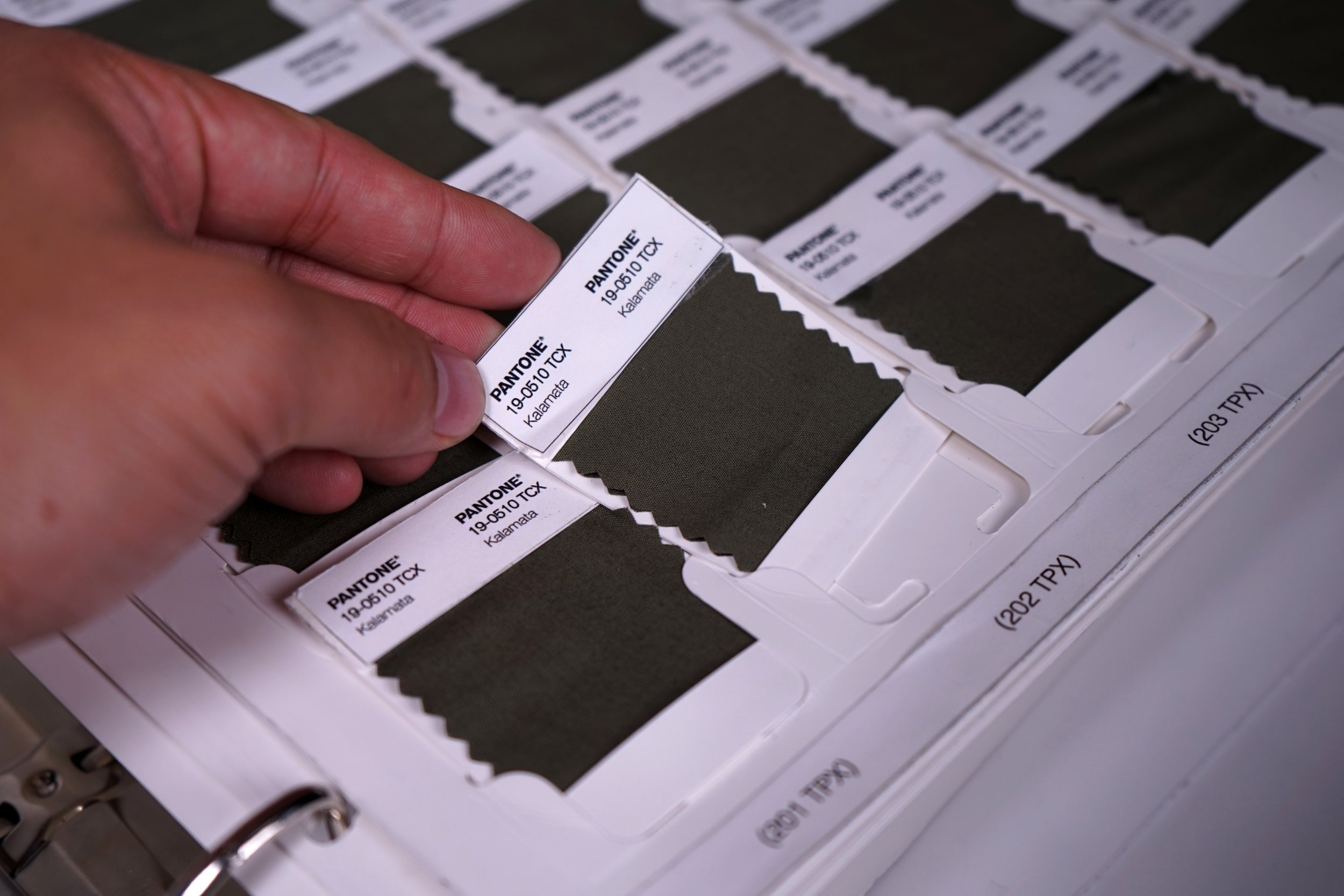
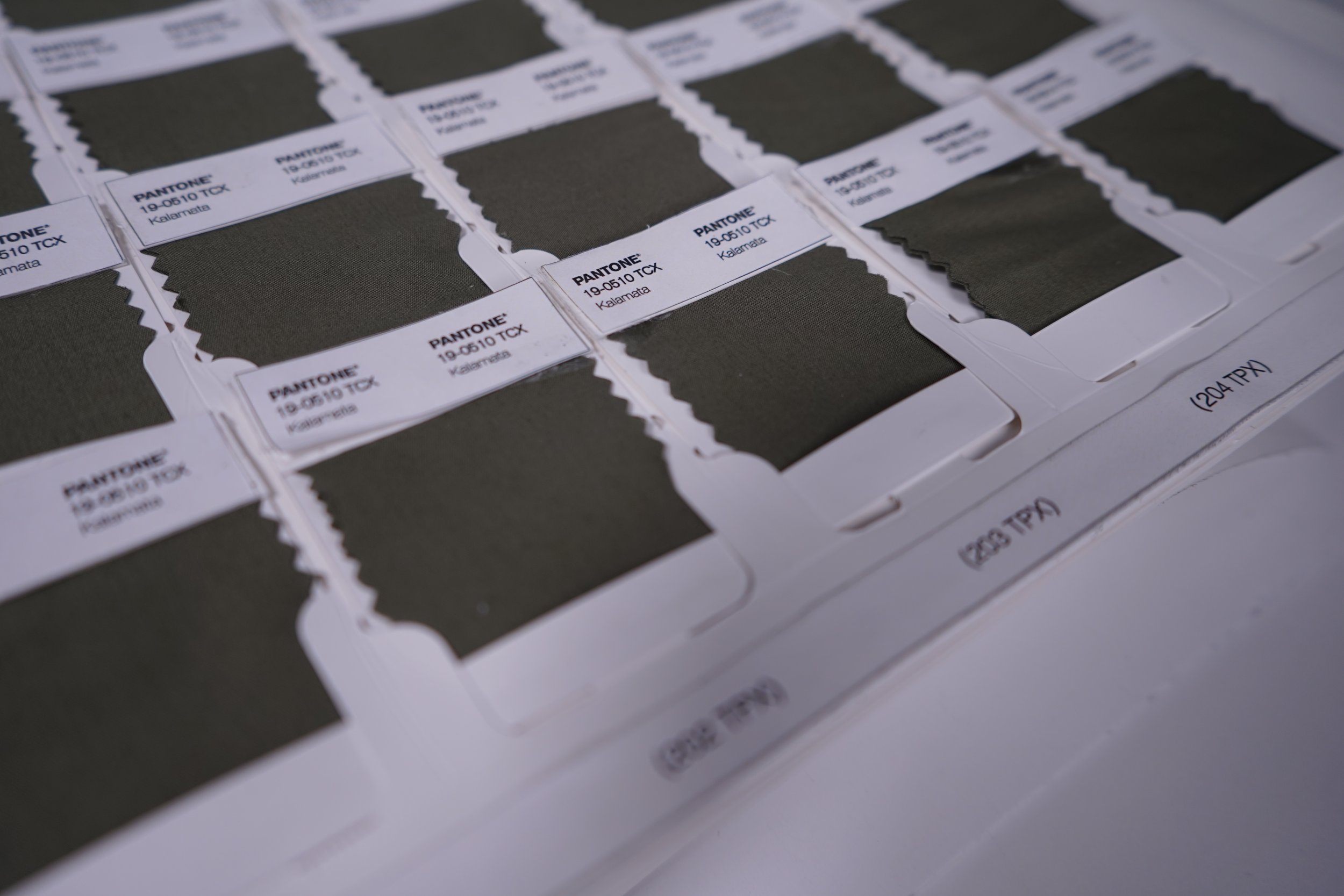
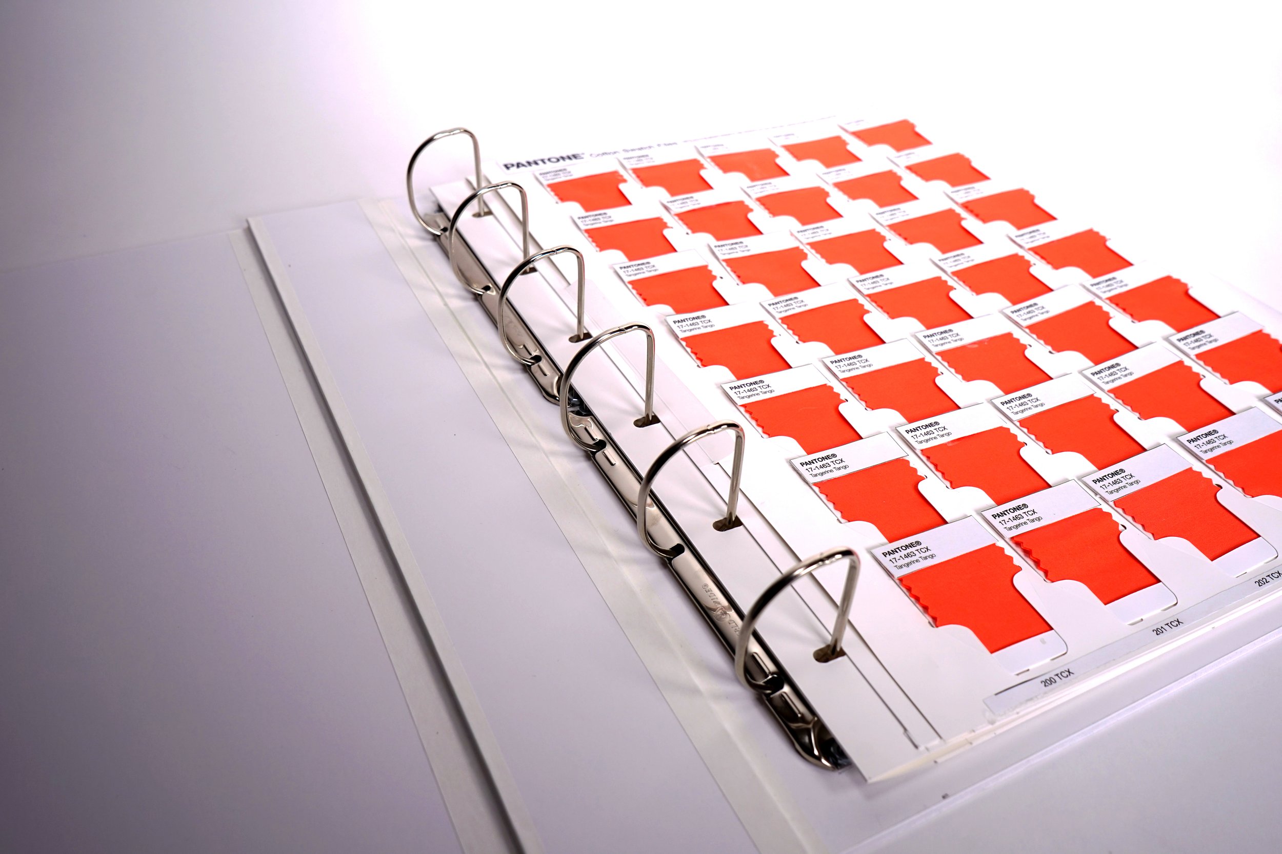
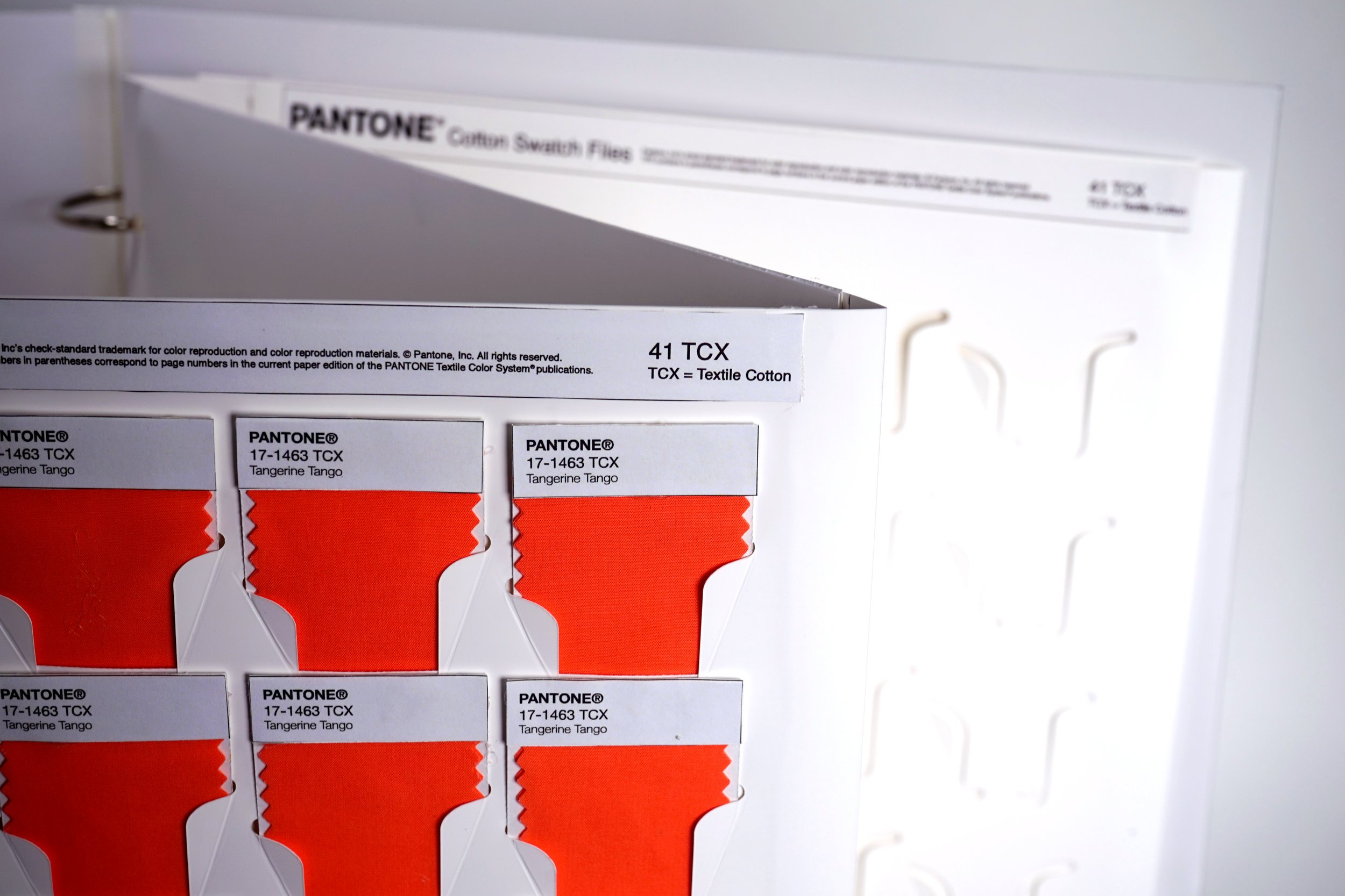
The final delivered design included our final interaction of the asymmetrical die cut pattern to secure the swatches, improved swatch identification on both the swatch and on the pages, and a redesigned swatch card with a flap at the bottom to protect the swatch from daily wear and tear.
Pantone® Cotton Swatch Library
